


 12345
12345 

filter by Title A B C D E F G H I J K L M N O P Q R S T U V W X Y Z [all]
| ID | Title | Description | |
|---|---|---|---|
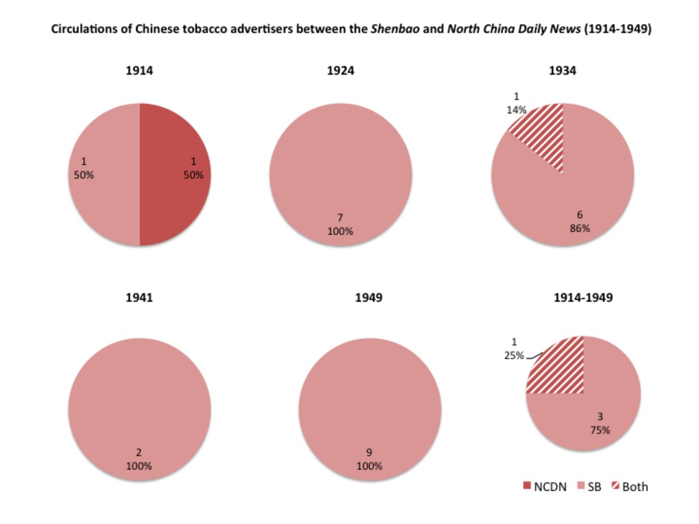
 | 294 | Circulations of tobacco advertisers between the newspapers Shenbao and North China Daily News (1914-1949) | Ce graphique a été réalisé à partir de la table associée : http://madspace.org/cooked/Tables?ID=157 |
 | 295 | Circulations of cigarette brands between the newspapers Shenbao and North China Daily News (1914-1949) | Ce graphique a été réalisé à partir de la table associée : http://madspace.org/cooked/Tables?ID=157 |
 | 296 | Circulations of tobacco advertisers within the Shanghai press, according to their nationalities: Chinese and Western (1914-1949) | Ce graphique a été réalisé à partir de la table associée : http://madspace.org/cooked/Tables?ID=157 |
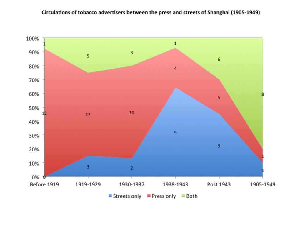 | 297 | Circulations of tobacco advertisers between the press and streets of Shanghai (1905-1949) | Ce graphique a été réalisé à partir de la table associée : http://madspace.org/cooked/Tables?ID=157 |
 | 298 | Circulations of cigarette brands between the press and streets of Shanghai (1905-1949) | Ce graphique a été réalisé à partir de la table associée : http://madspace.org/cooked/Tables?ID=157 |
 | 299 | Circulations of tobacco advertisers between the press and streets of Shanghai, according to their nationalities: Chinese and Western (1905-1949) | Ce graphique a été réalisé à partir de la table associée : http://madspace.org/cooked/Tables?ID=157 |
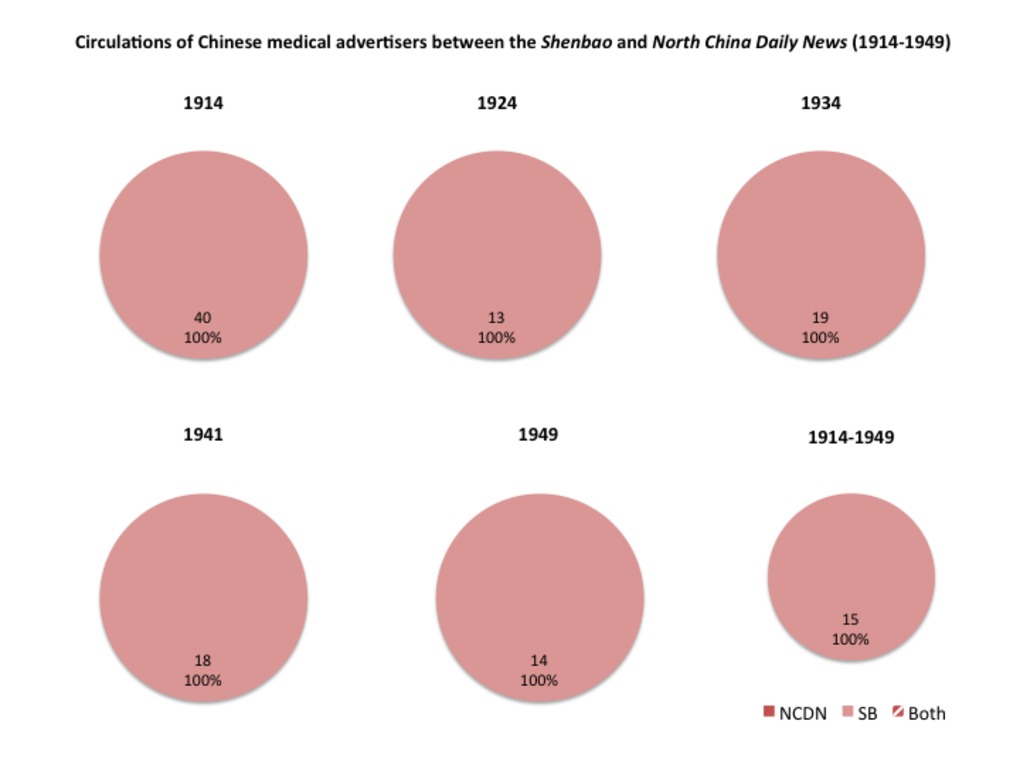
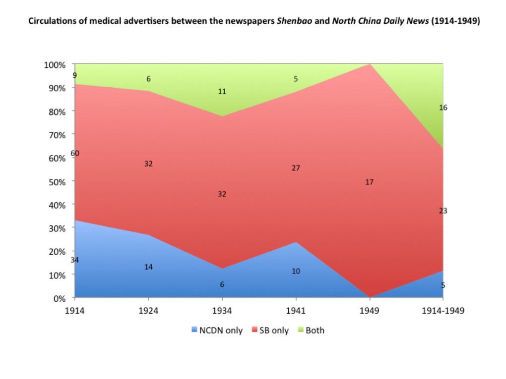 | 300 | Circulations of medical advertisers between the newspapers Shenbao and North China Daily News (1914-1949) | Ce graphique a été réalisé à partir de la table associée : http://madspace.org/cooked/Tables?ID=156 |
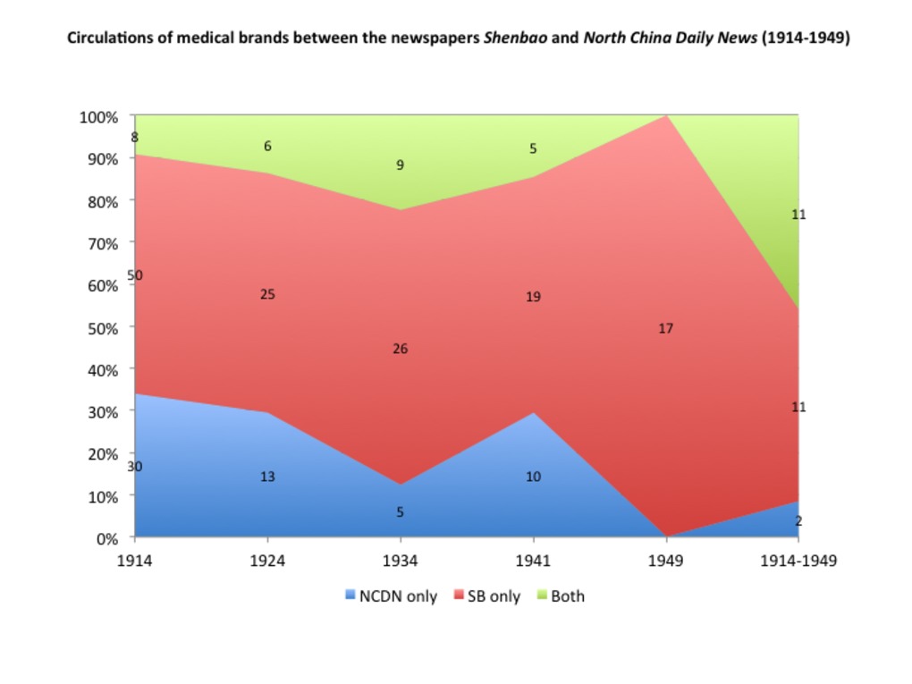 | 301 | Circulations of medical brands between the newspapers Shenbao and North China Daily News (1914-1949) | Ce graphique a été réalisé à partir de la table associée : http://madspace.org/cooked/Tables?ID=156 |
 | 302 | Circulations of medical advertisers within the Shanghai press, according to their nationalities: Chinese, Western, Japanese (1914-1949) | Ce graphique a été réalisé à partir de la table associée : http://madspace.org/cooked/Tables?ID=156 |
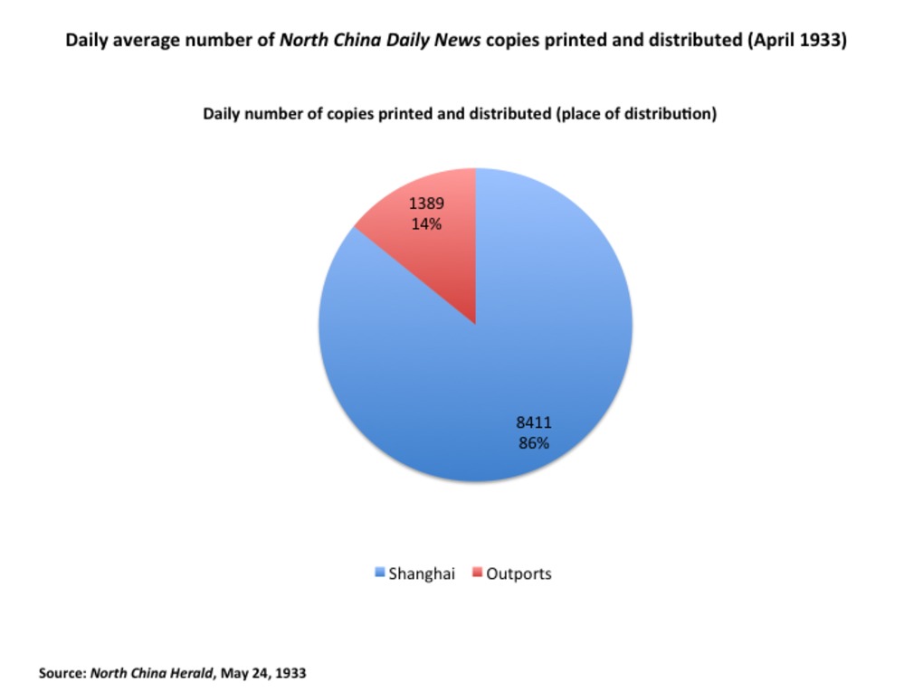 | 303 | North China Daily News circulation: Average daily number of copies printed and distributed (1933) | Source: "A circulation census. Increase in Chinese readers: Distribution Statistics." North China Herald and Supreme Court Gazette. May 24, 1933. |
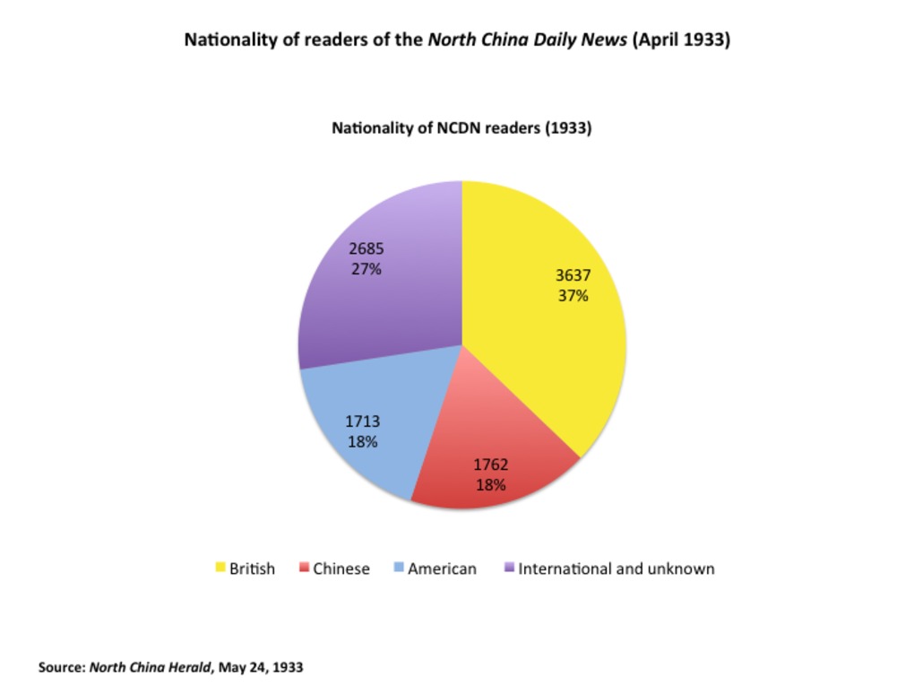 | 304 | North China Daily News circulation: Readers' nationality (1933) | Source: "A circulation census. Increase in Chinese readers: Distribution Statistics." North China Herald and Supreme Court Gazette. May 24, 1933. |
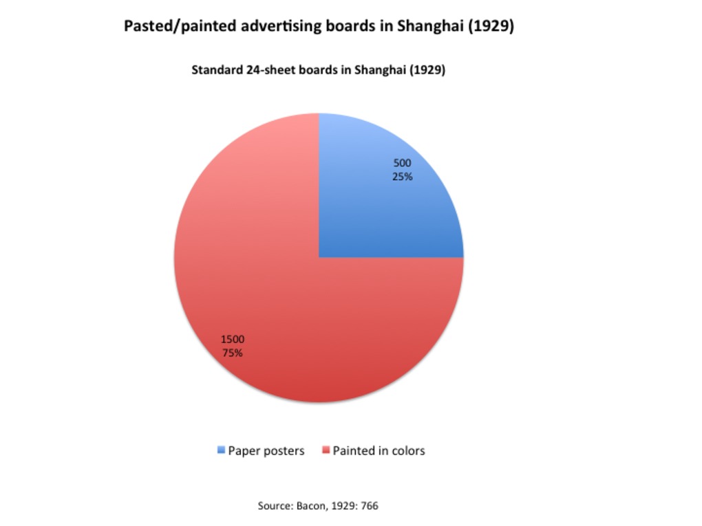 | 305 | 24-sheet boards in Shanghai: Prevailing of color-painted over paper-pasted boards (1929) | This pie charts shows the number and ratio of advertising boards (standard 24-sheet boards) in Shanghai before 1929, according to their materials - either paper/pasted or painted in color. Boards painted in colors clearly prevailed over paper pasted boards at the time. The preference for painted boards may result from their relative material resistance to bad weather and climatic conditions. Source: Bacon, 1929: 766. |
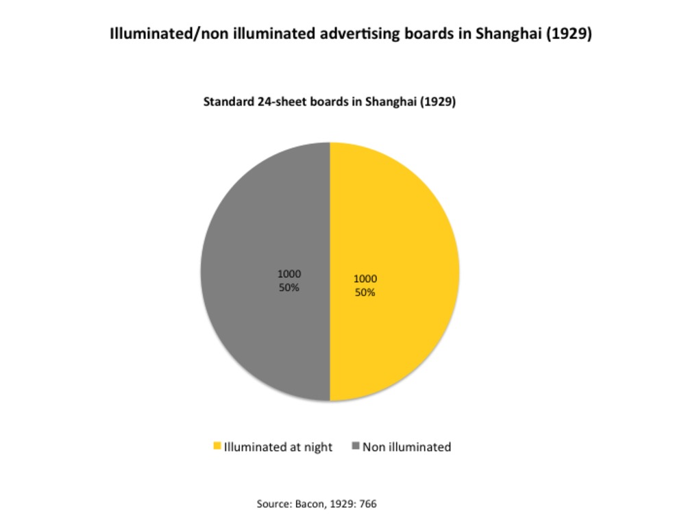 | 306 | 24-sheet boards in Shanghai: Equal distribution between illuminated/non illuminated boards (1929) | This pie charts shows the number and ratio of advertising boards (standard 24-sheet boards) in Shanghai before 1929, according to their illumination status - either illuminated or not. Before the popularization of light in the 1930s, illuminated boards were as numerous are non illuminated boards. This suggests that illumimated structures remains quite expensive for advertisers to build and maintain. Source: Bacon, 1929: 766. |
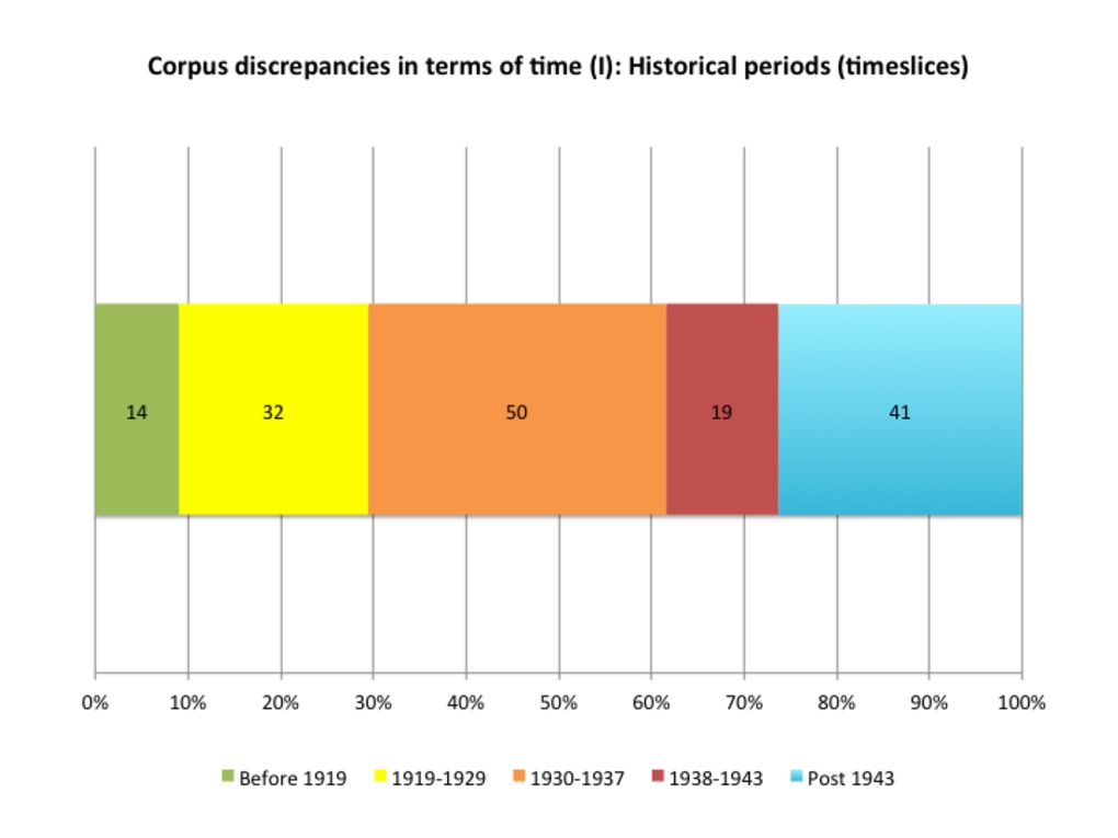 | 310 | A critical view of my photographic corpus (1905-1949): Temporal discrepancies (timeslices) | This graph aims to better visualize corpus discrepancies in terms of time (number and % of photos taken per timeslices). This graph has been drawn after the related table (See the "Tables" section - Table 171). |
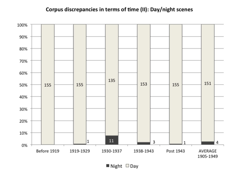 | 311 | A critical view of my photographic corpus (1905-1949): Temporal discrepancies (day/night scenes) | This graph aims to better visualize corpus discrepancies in terms of time - more precisely the uneven distribution between day/night scene, depending on timeslices. This graph been drawn after the related table (See the "Tables" section - Table 171). |
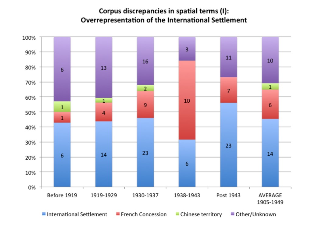 | 312 | A critical view of my photographic corpus (1905-1949): Spatial discrepancies (I): Overrepresentation of the International Settlement | This graph aims to better visualize corpus discrepancies in terms of space - more precisely the overrepration of the International Settlement (compared to French Concession and Chinese territories) depending on timeslices. It also reveals difficulties to attribute precise locations to many photos (especially before the 1930s). This graph has been drawn after the related table (See the "Tables" section - Table 171). |
 | 313 | A critical view of my photographic corpus (1905-1949): Spatial discrepancies (II): Favored places pictured the International Settlement | This graph aims to better visualize corpus discrepancies in terms of space - more precisely the overrepration of the Central district (Bund, Nanking Road, etc), and to a lesser extent, the Western district (Race Course) in the International Settlement - depending on timeslices. This graph eventually reveals photographic "topoi" or landmarks in Shanghai. It also reflects difficulties to attribute precise locations to many photos (especially before the 1930s). This graph has been drawn after the related table (See the "Tables" section - Table 171). |
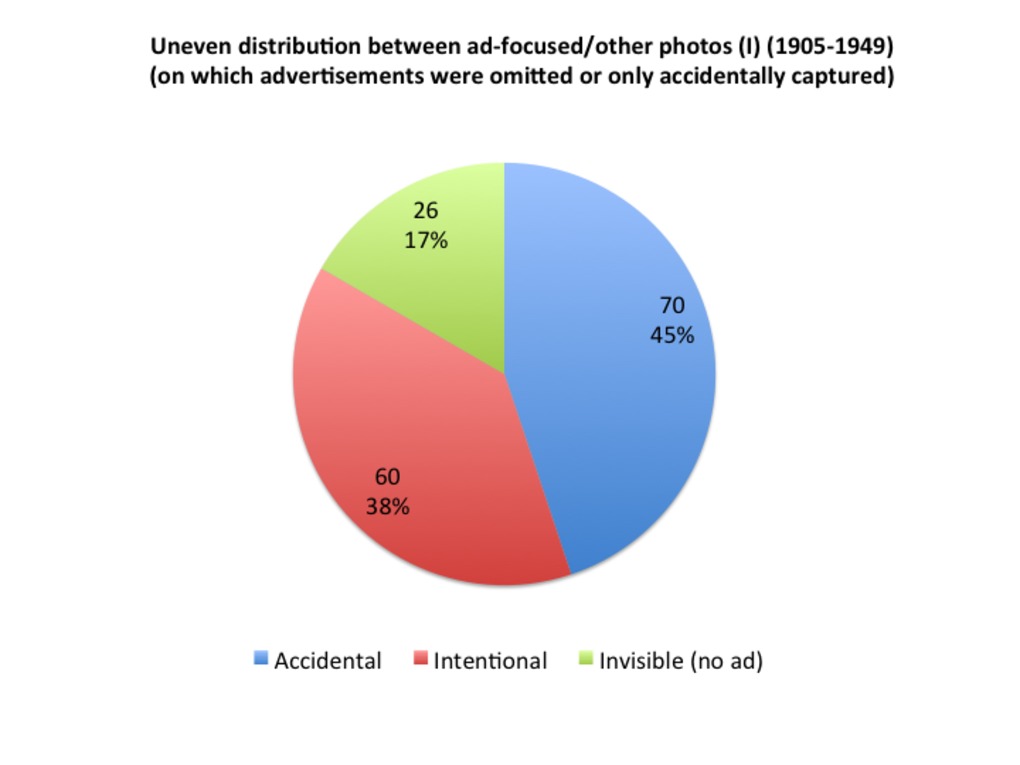 | 314 | A critical view of my photographic corpus (1905-1949): Uneven distribution between ad-focused and other photos (all period included) | This graph aims to better visualize the uneven distribution between ad-focused photos (photos that took advertisements as their intentional targets) (in red) and other photos (on which advertisements were either omitted or only accidentally captured). This graph has been drawn after the related table (See the "Tables" section - Table 171). |
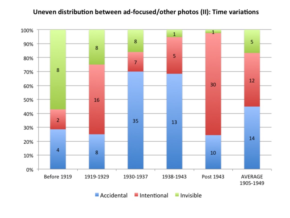 | 315 | A critical view of my photographic corpus (1905-1949): Uneven distribution between ad-focused and other photos (time variations) | This graph offered a refined view of the uneven distribution between ad-focused photos (photos that took advertisements as their intentional targets) (in red) and other photos (on which advertisements were either omitted or only accidentally captured), taking the time period into account. This graph reveals an increased advertising awareness at the end of the period - or more exactly, that professional photographers who chose advertisements as their intentional target were concentrated in the 1940s. This graph has been drawn after the related table (See the "Tables" section - Table 171). |
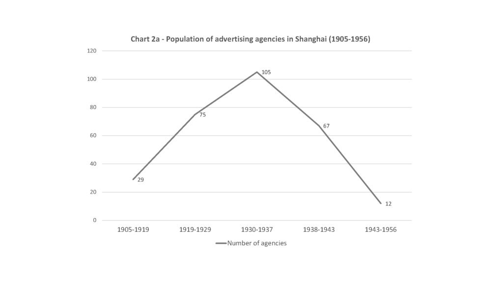 | 316 | Total population of advertising agencies in modern Shanghai | Graph showing the general increase in the total population of advertising agencies in Shanghai, especially during the 1930s decade. Source: Banker’s Directory (1935), Hong List (1941), SMA. |
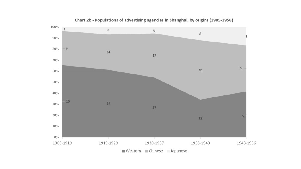 | 317 | Population of advertising agencies in Shanghai by their respective origins | Graph showing the number of advertising agencies in Shanghai, according their respective origins (Western, Chinese, Japanese). The chart particularly reveals the gradual catch-up process by Chinese agencies since the 1930s decade. Source: Banker’s Directory (1935), Hong List (1941), SMA. |
 | 318 | China Commercial Advertising Agency’s staff and clients | Graph showing the number of employees and clients of one of the first and leading Chinese agencies - the China Commercial Advertising Agency (CCAA) - founded in Shanghai in 1926. The chart reveals CCAA's spectacular growth during the decade 1926-1936. |
 | 319 | China Commercial Advertising Agency’s financial situation | Graph showing the capital, income and profits of one of the first and leading Chinese agencies - the China Commercial Advertising Agency (CCAA) - founded in Shanghai in 1926. The chart reveals CCAA's spectacular growth between 1926 and 1940. Source: SMA, Q275-1-1840-37, Q275-1-1840-1. |
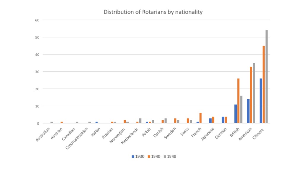
 | 320 | Members of the Shanghai Rotary Club (year of election and nationality) | The following graphs shows the number and nationality of new members elected at the Shanghai Rotary Club each year between 1919 and 1939. They derive from the list of Rotarian members drawn after the Shanghai Rotary Club handbook (see table: http://madspace.org/cooked/Tables?ID=198). The first graph reveals a general increase in membership especially at the end of the period, with a peak in 1936 (almost three times the figure of 1935 and more than ten times that of 1919). The second graphs shows the distribution of members according to their nationality. It reveals that the Chinese form the most important group in the Club,(46, 38%), followed by Americans (31, 24%), British (15, 19%), French (6, 4,7%), Japanese and German (4 each) and other European minorities. The third graph shows the date of election by nationality. Originally new members were mostly American and British. Yet Chinese members were elected at a very early time (1920). Chinese membership reached a turning point after 1927 (coinciding with the integration of Chinese representatives within the Shanghai Municipal Council). The Rotary Club started to include German, Japanese, Russian and French members in 1927, 1929, 1930 and 1931, respectively. Then we observe a trend towards a diversification of membership. New European minorities (Swiss, Netherlands, Norwegian) became members only at the end of the period (after 1935). |
 | 321 | Members of the Shanghai Rotary Club (occupations and socio-professional categories) | The following graphs shows the structure of occupations and socio-professional categories of Shanghai Rotarians between 1919 and 1939. They derive from the original list of members drawn after the Shanghai Rotary Club handbook (see table: http://madspace.org/cooked/Tables?ID=198).
|
 | 322 | Members of the Shanghai Rotary Club (business address and residence in Shanghai) | The following graphs shows the Rotarians' business address and residence in Shanghai, according to their class of occupations and nationality, respectively. They derive from the original list of members drawn after the Shanghai Rotary Club handbook (see table: http://madspace.org/cooked/Tables?ID=198).
|
 | 323 | Sociology of the Peking Rotary Club | This is a preliminary analysis of the membership of the Peking (Beijing) Rotary Club in 1937. The data comes from a roster of members I found in Arnold Papers, Hoover Institution Archives. In the following graphs, I analyze members' nationality (distribution between Chinese/foreign members), occupations and class of business (and the combination between nationality and class of business). For each analysis, we offer two kinds of visualization: histograms (for absolute values) and pie charts or staked charts (for relative values). NB The first attached file is purely illustrative. To access the complete analysis, please open the PDF file. |
 | 324 | Sociology of the Shanghai Rotary Club | This is a preliminary analysis of the membership of the Shanghai Rotary Club between 1930 and 1948. The data comes from three successive rosters (published in 1930, 1940 and 1948) that I found in Calder Papers, Hoover Institution Archives. In the following graphs, I analyze members’ year of election, their nationality (and the combination of both), their occupation and class of business (which I also combined with their nationality) and how they evolved over time, their business address and place of residence in Shanghai (depending also on their occupation and nationality) - whenever available. Depending on the data and for legibility reasons, we offer two kinds of visualization: histograms and pie charts. The last slides also offer a rudimentary analysis of Rotarians’ networks (for which I relied on Cytoscape). NB The first attached file is purely illustrative. To access the complete analysis, please open the PDF files. The first two PDF offer snapshots of Rotarian membership in 1940 and 1948 ; the last PDF provides a long-term perspective based on the compiled data drawn from the three rosters. It offers more in-depth analyses of selected case studies (e.g. Chinese, American and British members' occupations) and a distant view of membership duration. |
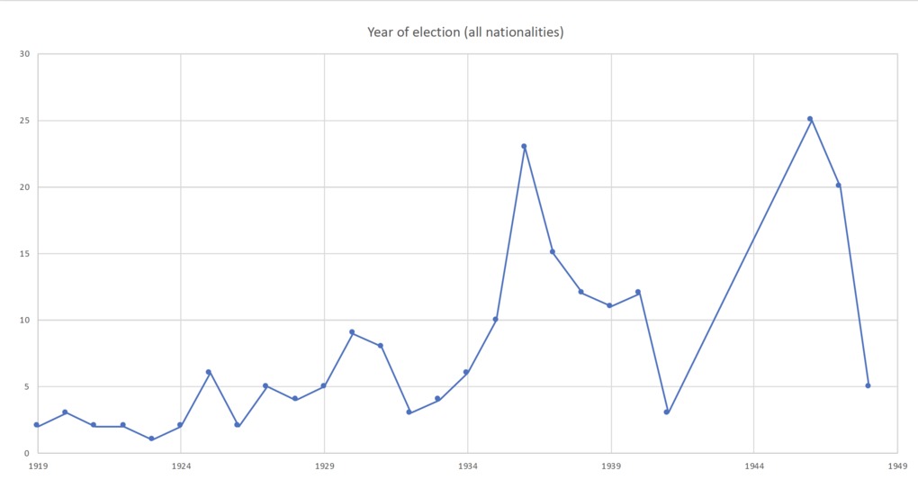 | 325 | Sociography of the Shanghai Rotary Club: year of election | Relying on three rosters of members published in 1930, 1940 and 1948, the following graphs visualize the evolution of the election strategies of the Shanghai Rotary Club over the period 1919-1948, in general and according to the members' nationality. NB For better legibility, please refer to the attached PDF (doc 3) |
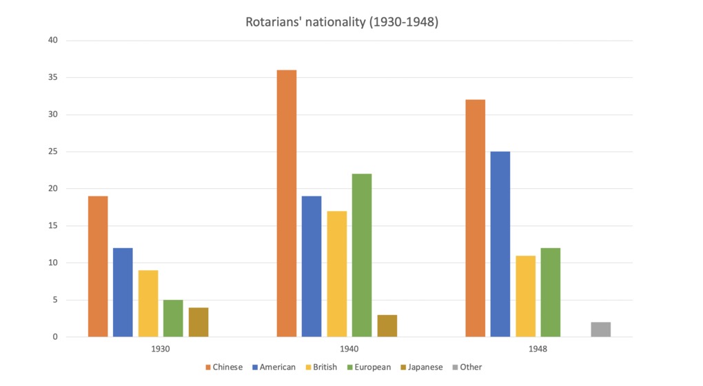 | 326 | Sociography of the Shanghai Rotary Club: members' nationality | Relying on three rosters of members published in 1930, 1940 and 1948, the following graphs visualize the evolution of members' nationality of the Shanghai Rotary Club over the period 1919-1948. I offer three different kinds of visualization: vertically grouped histograms, successive pie chart, and horizontal stacked charts (in the form of timelines). NB For better legibility, please refer to the attached PDF (doc 34 |
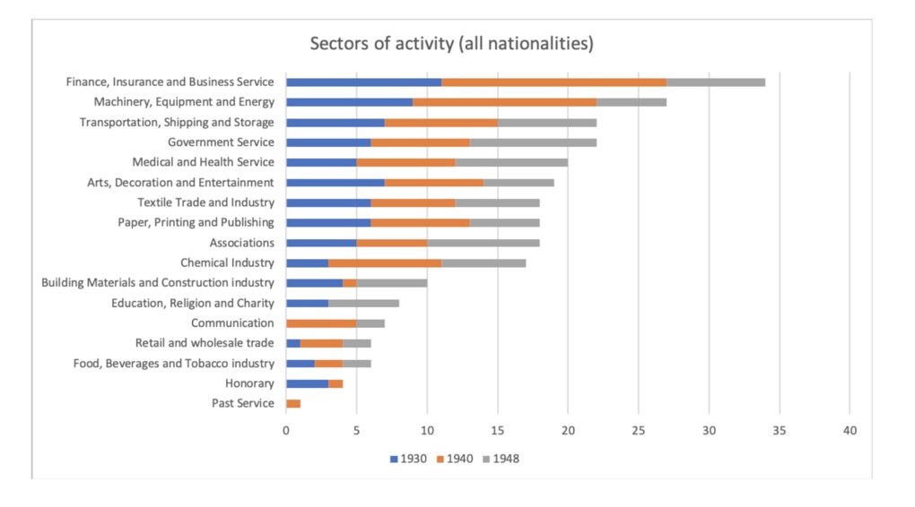 | 328 | Sociography of the Shanghai Rotary Club: Rotarians' sectors of activity | Relying on three rosters of members published in 1930, 1940 and 1948, the following graphs aim at analyzing members' sectors of activity over the period 1919-1948, in general and by nationality, with a particular focus on the three dominating groups (Chinese, American and British Rotarians). NB For better legibility, please refer to the attached PDF (doc 5) |
 | 329 | Sociography of the Shanghai Rotary Club: Rotarians' occupations (1) | Relying on three rosters of members published in 1930, 1940 and 1948, the following graphs aim at analyzing members' occupations (at a very general level) over the period 1919-1948, in general and by nationality, with a particular focus on the three dominating groups (Chinese, American and British Rotarians). NB For better legibility, please refer to the attached PDF (doc 5) |
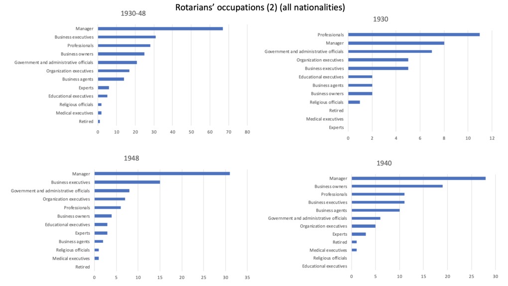 | 330 | Sociography of the Shanghai Rotary Club: Rotarians' occupations (2) | Relying on three rosters of members published in 1930, 1940 and 1948, the following graphs aim at analyzing members' occupations (at a finer level, closer to the Rotarian's typology in the original document) over the period 1919-1948, in general and by nationality, with a particular focus on the three dominating groups (Chinese, American and British Rotarians). NB For better legibility, please refer to the attached PDF (doc 5) |
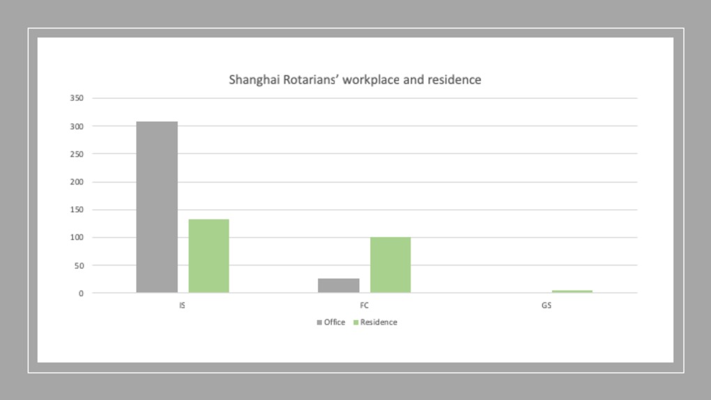 | 331 | Sociography of the Shanghai Rotary Club: Rotarians' places of work and residence | Relying on three rosters of members published in 1930, 1940 and 1948, the following graphs aim at mapping Rotarians' offices and residences in Shanghai over the period 1930-1948, all nationalities included (graphs 1 and 2), and according to their nationality (Chinese: graph 3, American : graph 4, British : graph 5). NB For a more legible version of the graphs, please see the attached PDF (file 6)
|
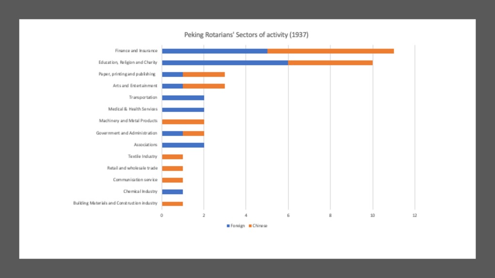 | 332 | Sociography of the Peking Rotary Club: sectors of activity | Relying on a roster of members published in 1937, the following graphs aim at analyzing Peking members' sectors of activity. NB For better legibility, please refer to the attached PDF |
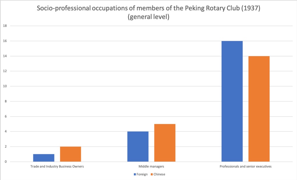 | 333 | Sociography of the Peking Rotary Club: occupations | Relying on a roster of members published in 1937, the following graph aim at analyzing Peking Rotarians' social-professional occupations (at a very general level and als more detailed professions).
|
 | 334 | Sociography of the Peking Rotary Club: nationality | Relying on a roster of members published in 1937, the following graph aim at analyzing Peking Rotarians' nationalities
|
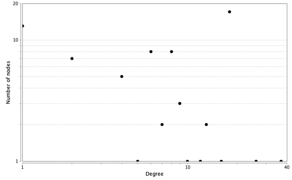
 | 335 | Degree distribution in two-mode networks of meeting attendance at the Shanghai Rotary Club | This sets of three graphs compare degree distribution in the three two-mode networks of meeting attendance at the Shanghai Rotary Club under President Petit's (1919-20), Fitch's (1930-1) and Harkson's (1938-9) terms. The original datasets and the resulting graphs are available in the "Tables" and "Trees" section, respectively. NB We used Cytoscape Network Analyzer application to make these graphs. |
 | 336 | Degree distribution in one-mode networks of co-attendance at meetings of the Shanghai Rotary Club | This sets of three graphs compare degree distribution in the three one-mode networks of co-attendance at the meetings of the Shanghai Rotary Club under President Petit's (1919-20), Fitch's (1930-1) and Harkson's (1938-9) terms. The original datasets and the resulting graphs are available in the "Tables" and "Trees" section, respectively. NB We used Cytoscape Network Analyzer application to make these graphs. |
 | 337 | Degree and between centrality in one-mode networks of co-attendance at meetings of the Shanghai Rotary Club | This sets of three graphs cross-analyzes degree and betweenness centrality in the three one-mode networks of co-attendance at the meetings of the Shanghai Rotary Club under President Petit's (1919-20), Fitch's (1930-1) and Harkson's (1938-9) terms. The original datasets and the resulting graphs are available in the "Tables" and "Trees" section, respectively. We used Cytoscape Network Analyzer application to make these graphs. In Petit’s network, we observe a direct correlation between degree and betweenness. Those who have the highest number of neighbors also serve as brokers, except for the medium group of non-members with a degree of 18 who show a very low betweenness centrality. On the opposite, two Rotarians (one director and one charter member) who are not particularly influential (degree 12 and 16 respectively) show an exceptionally high betweenness centrality (0.67 and O.4, respectively). In Fitch’s network, there is no obvious correlation between degree and betweenness. Except for the president himself, who shows the highest betweenness centrality of 0.8, acting as the main hub in the network, no other person serves as broker in this network. This confirms the high centralization of Rotary network around its president Fitch during his term. Under Harkson’s presidency, we again observe a strong (yet not perfect) correlation between degree and betweenness. Four persons act as intermediaries in this network, showing both a high degree centrality and high betweenness (including the vice-president Wolfe and the president Harkson). There are two minor exceptions to this general rule, however. The president ranked second in terms of intermediarity, but came only third in degree centrality. One ordinary Chinese member shows a moderate degree of 8 but a fairly high betweenness of 0.29 (which contrasts to the null betweenness of other persons in the same class). For a detailed list of personal profiles in each category, please refer to the "tables" section.
|
 | 338 | Tie weight distribution in one-mode networks of co-attendance at meetings of the Shanghai Rotary Club ("sum" method) | This sets of three graphs compare tie weight distribution in the three one-mode networks of co-attendance at the meetings of the Shanghai Rotary Club under President Petit's (1919-20), Fitch's (1930-1) and Harkson's (1938-9) terms. In this network, nodes represent participants (persons who attended meetings), whereas edges represents events. Any edge links two persons who participate in the same events. Tie weight measures how frequently two persons co-participate in meetings. This series of graphs is based on the “sum” method. 1 means that persons met only once, 2 that they attend twice the same meeting, 3 three times, and so on. Unsurprisingly, there is a reversely proportional relation between tie weight (number of events co-attended) and number of dyads (co-attending pairs). Those who met regularly are the least frequent. Conversely, pairs who met only once are the most frequent. The first graph refers to Petit's network, the second to Fitch's and the last one to Harkson's. The original datasets and the resulting graphs are available in the "Tables" and "Trees" section, respectively. We used the R package "dplyr" to make these graphs.
|
 | 339 | Tie weight distribution in one-mode networks of multiple role-holding at meetings of the Shanghai Rotary Club | This sets of three graphs compare tie weight distribution in the three one-mode networks of multiple attendance at the meetings of the Shanghai Rotary Club under President Petit's (1919-20), Fitch's (1930-1) and Harkson's (1938-9) terms. In this network, nodes represent social roles (role types) performed by participants during club meetings, whereas edges represent persons holding multiple roles. Any edge links two roles performed by the same person. The absence of ties reflects incompatible roles. Tie weight expresses the most frequent combinations of roles (using the “sum” method). The original datasets and the resulting graphs are available in the "Tables" and "Trees" section, respectively. We used the R package "dplyr" to make these graphs.
|
 | 340 | Tie weight distribution in one-mode networks of multiple attendance at meetings of the Shanghai Rotary Club | This sets of three graphs compare tie weight distribution in the three one-mode networks of multiple attendance at the meetings of the Shanghai Rotary Club under President Petit's (1919-20), Fitch's (1930-1) and Harkson's (1938-9) terms. In this network, nodes represent events (club meetings), whereas edges represents the attendees they have in common. Any edge links two events who share participants. The absence of ties reflects events that have no participants in common. Tie weight expresses the number of multiple participants (using the “sum” method). The original datasets and the resulting graphs are available in the "Tables" and "Trees" section, respectively. We used the R package "dplyr" to make these graphs. Unsurprisingly, there is a reversely proportional relation between tie weight (number of shared participants) and number of dyads (events that share participants). Those who shared many participants are the least frequent. Conversely, events that have only one participant in common are the most frequent. |
 | 341 | Tie weight distribution in one-mode networks of co-attendance at meetings of the Shanghai Rotary Club (Newman's method) | This sets of three graphs compare tie weight distribution in the three one-mode networks of co-attendance at the meetings of the Shanghai Rotary Club under President Petit's (1919-20), Fitch's (1930-1) and Harkson's (1938-9) terms. In this network, nodes represent participants (persons who attended meetings), whereas edges represents events. Any edge links two persons who participate in the same events. Tie weight measures how frequently two persons co-participate in meetings. This series of three graphs is based on Newman's method, which presents the advantage of rectifying the negative effects of size variation – by discounting most important events that are more likely to be attended than smaller events, and key officers that are more likely to attend compared to less active members, occasional guests and visitors. The first graph refers to Petit's network, the second to Fitch's and the last one to Harkson's. The original datasets and the resulting graphs are available in the "Tables" and "Trees" section, respectively. We used the R package "dplyr" to make these graphs.
|
 | 342 | Number of articles published in the Chinese Economic Journal, per issue | Based on the following dataset, the attached graphs visualize the number of articles published in the Chinese Economic Monthly/Journal between 1924 and 1936. Relying on R package "ggplot2", we propose two main types of visualization - graph lines and bar charts - to explore variations in the number of articles and topics per issue. The code used for classifying topics is described in the notice attached to the original dataset. |
 | 343 | Number of articles published in the Chinese Economic Journal, per period | Based on the following dataset, the attached graphs visualize the number of articles published in the Chinese Economic Monthly/Journal between 1924 and 1936. Relying on R package "ggplot2", we used faceted, colored and stacked bar charts to explore variations in the number of articles and topics per period. The codes used for classifying topics and for periodizing the history of the journal are described in the notice attached to the original dataset. |
 | 344 | Length of articles published in the Chinese Economic Journal, per issue and topic | Based on the following dataset, the attached graph visualizes the average, minimum and maximal length of authored articles (measured by the number of pages) in each issue of the Chinese Economic Monthly/Journal between 1924 and 1936, depending on the topic they address. Relying on R package "ggplot2", we alternatively used faceted graph line (1) and boxplots (2) to visualize variations in the length of articles from one topic to the other. The code used for classifying topics is described in the notice attached to the original dataset. |
 | 345 | Range of topics covered by the Chinese Economic Journal, per issue | Based on the following dataset, the attached graph visualizes the range of topics covered by each issue of the Chinese Economic Monthly/Journal between 1924 and 1936. We relied on R package "ggplot2" to build this graph. |
 | 346 | Length of articles published in the Chinese Economic Journal, per issue (all topics included) | Based on the following dataset, the attached graph visualizes the average, minimum and maximal length of authored articles (measured by the number of pages) in each issue of the Chinese Economic Monthly/Journal between 1924 and 1936, all topics included. Relying on R package "ggplot2", we alternatively used scattered plots (1), graph line (2) and smoothing (3) to visualize variations in the length of articles from one issue to the other, and between articles within the same issue. |
 | 347 | Authorship in the Chinese Economic Journal | Based on the following dataset, the attached graphs explore the nature of authorship the Chinese Economic Monthly/Journal between 1924 and 1936, in relation to the the length of articles (1) and to the topics they addressed (2, 3). Relying on R package "ggplot2", we alternatively used boxplots (1, 2) and bar charts (3). The codes used for classifying topics and authorship are described in the notice attached to the original dataset. |
 | 348 | Contributors to the Chinese Economic Journal, per period (origin) | Based on the following dataset, the attached graphs visualize the origin of contributors to the Chinese Economic Monthly/Journal between 1924 and 1936, per period. Relying on R package "ggplot2", we alternatively used faceted and stacked bar charts. What is striking on these graphs is the meteoritic rise of Chinese contributors from 1928 onwards. The next set of graphs will explore the contributors' nationality in greater details. |
 | 349 | Contributors to the Chinese Economic Journal, per period (nationality) | Based on the following dataset, the attached graphs visualize the nationality of contributors to the Chinese Economic Monthly/Journal between 1924 and 1936, all periods included (2) and per period (1, 3). Compared to the related graphs that merely discriminate between Chinese and foreign contributors, this set explores the distribution of national groups in greater details. Relying on R package "ggplot2", we alternatively used faceted and stacked bar charts. |
 | 350 | Contributors to the Chinese Economic Journal, per period (gender) | Based on the following dataset, the attached graphs explore the gendered distribution of contributors to the Chinese Economic Monthly/Journal between 1924 and 1936, per period (1) and all periods included (2). We relied on R package "ggplot2" to build these bar charts. Unsurprisingly, male contributors dominated during the entire period. Woman made but a small contribution during the first and third periods. |
 | 351 | Contributors to the Chinese Economic Journal, per period (field of specialization) | Based on the following dataset, the attached graphs explore contributors' fields of specialization (the academic disciplines in which they graduated) in the Chinese Economic Monthly/Journal between 1924 and 1936, all periods included (1), and per period (2, 3). Relying on R package "ggplot2", we alternatively used faceted and stacked bar charts. |
 | 353 | Chinese contributors to the Chinese Economic Journal, per period (field of specialization) | Based on the following dataset, the attached graphs explore more specificially Chinese contributors' fields of specialization (the academic disciplines in which they graduated) in the Chinese Economic Monthly/Journal between 1924 and 1936, all periods included (1), and per period (2, 3, 4). Relying on R package "ggplot2", we alternatively used stacked, dodged and faceted bar charts. |
 | 354 | Contributors to the Chinese Economic Journal, per period (level of education) | Based on the following dataset, the attached graphs explore contributors' level of education (the highest academic degrees obtained) in the Chinese Economic Monthly/Journal between 1924 and 1936, all periods included (1), and per period (2, 3, 4). Relying on R package "ggplot2", we alternatively used faceted, stacked and dodged bar charts. |
 | 355 | Chinese contributors to the Chinese Economic Journal, per period (level of education) | Based on the following dataset, the attached graphs explore Chinese contributors' level of education (the highest academic degrees obtained) in the Chinese Economic Monthly/Journal between 1924 and 1936, all periods included (1), and per period (2, 3, 4). Relying on R package "ggplot2", we alternatively used stacked and dodged bar charts. |
 | 356 | Contributors to the Chinese Economic Journal, per period (country of education) | Based on the following dataset, the attached graphs explore contributors' country of education (in country in which they received their highest degree) in the Chinese Economic Monthly/Journal between 1924 and 1936, all periods included (1), and per period (2). We relied on R package "ggplot2" to build these bar charts. These graphs reveals the heavy weight of the United States as the privileged destination for pursuing higher education. |
 | 357 | Chinese contributors to the Chinese Economic Journal, per period (country of education) | Based on the following dataset, the attached graphs explore Chinese contributors' country of education (the country in which they received their highest degree) in the Chinese Economic Monthly/Journal between 1924 and 1936, per period. Relying on R package "ggplot2", we alternatively used faceted and dodged bar charts. |
 | 358 | Contributors to the Chinese Economic Journal, per period (educational institutions) | Based on the following dataset, the attached graphs explore contributors' educational institutions (the university in which they received their highest degree) in the Chinese Economic Monthly/Journal between 1924 and 1936, with a particular focus on the United States (1) and China (2). We relied on R package "ggplot2" to build these bar charts. |